It is a simple concept. People don’t read ads; they read what interests them. So if you are going to create compelling and persuasive ads design, you are going to have to create something interesting that will help consumers want to read.
Check out our thoughts on creative marketing.
Here is a short video on psychology and ad design to get you thinking.
And, oh, by the way, it must be more interesting than the millions of other advertisements out there. Now that is a daunting task, isn’t it?

The secret of all effective advertising is not the creation of new and tricky words and pictures, but one of putting familiar words and pictures into new relationships.
– Leo Burnett
Does it have the power to encourage the right sort of conversations? We’ll discuss this point in a bit.
It has been said that advertising is the price to be paid for being unremarkable. That may be true, but I have noticed that even remarkable businesses also advertise the old fashion way. It is an essential component of your marketing campaign, for awareness or consumer education of your value.
Does the ad model have a future? Many think not.
The arguments are twofold: one based on supply and one based on demand. On the supply side, pundits say that consumers have grown tired of having their media experience interrupted and will increasingly avoid ads. On the demand side, they say that marketers are becoming savvier and are learning that advertising never worked anyway.
Both arguments are specious and don’t hold up to scrutiny.
As long as brands need to promote themselves and content need to be financed, the ad model will continue to prosper.
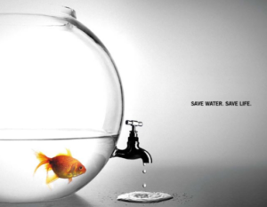
According to Nielsen, there are 27,000,000 pieces of content are shared each day. And Statistic Brain says that our average attention span has dropped from 12 seconds in 2000 to 8 seconds – one second less than a goldfish!
We check our phones 150 times per day. We check our email up to 30 times an hour. And the amount of information in the world continues to double every 18 months.
All this available information and data is creating a battle for customer attention between brands, publishers, and every one of us who creates content. But more importantly, it’s forcing businesses to think and act like publishers and creative designers.
Ever written an advertisement, or thought about it? I’ve done marketing for my clients in small businesses for the past 9+ years, and I’ve learned a few things about making advertising look professional even on a tight budget.
Many small businesses don’t have a lot of time or resources to have ads professionally made. So what’s a small business to do?
If everyone is creating content, how does a business break through the noise? How do we reach our customers in a way that engages them?
Here are six creative steps, ala killer techniques, we recommend you follow to create or critique your advertisements:
Advertising Campaign … Are the Geico Happiness Ads Effective?
Define your theme
Many themes to choose from … visual design, attention-grabbing, music, and emotion, just to name a few. There is no better subject as a means of influence or the power of persuasion than emotion. Hands down the best, in our opinion.
Experiences that trigger our emotions are saved and consolidated in lasting memory because the emotions generated by the experiences signal our brains that the skills are important to remember.

Build the message
Focus on customer needs end state and not the means. The end state is the only priority. Make the message as clean and straightforward as possible. You cannot overachieve on the simplicity of the message. A message that the reader will quickly understand. Keep in mind that pictures are far more valuable than words.
A good example of this is this Prudential’s billboard ad. This commercial considers the end state needs of its customers … the retirement needs of target customers are the business’s objective.
Ask a thoughtful question
You can always depend on asking thoughtful questions to grab the attention of your customers and getting them to think.
A good example is the recent Prudential commercial. Have you seen this ad design? You know … the one with the visualization design central to their story. Quite clever isn’t it, and likely one you will remember and maybe even talk about, right?
The ad starts out with the commentator asking people a simple, yet thoughtful question:
How much money do you have in your pocket right now?
After he collects everyone’s answer, he asks a second, more probing question:
Could something that small make an impact on something as big as your retirement goal?
Connect the dots
Your ads should connect the dots with other elements of your integrated marketing campaign. Remember; stop interrupting what people interested in, and be what people are interested in.
It was in early 2009 when IBM began its Smarter Planet marketing campaign strategy. At the time, the plan seemed very ambitious … maybe even a bit risky, even for IBM. But their success was based on a plan to build out a long-term campaign.
To do this, they defined a theme around their vision (Smarter Planet). They used the idea to craft a marketing strategy connecting and integrating many smaller marketing objectives and tactics as they could. They also linked their core competencies to this theme, vision, and challenge. Apparently, they made sure they were all obvious to their customers.
This very successful campaign continues today, five years later.
Persuasive ads … a simple story
A good story has a beginning where a sympathetic character encounters a complicating situation, a middle where the character confronts and attempts to resolve the situation, and an end where the outcome is revealed. It does not interpret or explain the action in the story for the audience.
Instead, a good story allows each member of the public to understand the story as he or she understands the work. This is why people find good stories so appealing and why they find advertising that merely conveys facts and information boring.

Persuasive ads 2017 … create a visual analogy
Look for ways to illustrate your messages with visualization. Visual analogies are even better. A great example of this technique is the recent Prudential commercial we discussed previously. You know … the one with the visualization design central to their story.
To make this point with a visual analogy, the commentator points to a series of dominoes, smallest to largest. When he makes his point on putting away investments consistently over time, he knocks over the smallest domino, which causes the chain reaction to topple all the dominoes. A great analogy to the retirement goal being achieved … as the dominoes fall the emotion rises.
Key takeaways
I’m not as much surprised as saddened that such nutty beliefs and misconceptions about advertising (and marketing overall) can lead otherwise smart, creative people to squander their effort, money and the patience of would-be consumers.
I’m sure there are binders full of the rationale for why it’s stunningly brilliant stuff, and there’ll be metrics that declare the spot a wild success. But believing those arguments, or valuing those outcomes, requires that you swallow the message hook line and sinker. Not me.
So if you remember one thing from this article, remember this:
Marketing or advertising, you need to create information that your customers find interesting and worth talking about and remembering. And stand for things that potential customers value.
We believe an effective ad is interesting, entertaining, and stands for things viewers can stand behind. We think it is persuasive and certainly, creates the right kind of conversation.
Does the ad model have a future? Many think not.
The arguments are twofold: one based on supply and one based on demand. On the supply side, pundits say that consumers have grown tired of having their media experience interrupted and will increasingly avoid ads. On the demand side, they say that marketers are becoming savvier and are learning that advertising never worked anyway.
Both arguments don’t hold up to scrutiny.
As long as brands need to promote themselves and content need to be financed, the ad model will continue to prosper.
What do you think?
Heard enough? I rest my case.
