Simple Presentation Slides: The Go-Getter’s Guide to Improvement
With more than 40+ years of business, I have seen and given more than my share of presentations. Do you know my biggest pet peeve? Having simple presentation slides, hands down. Why should this be such a challenge? In my opinion, it is because the presenter needs the crutch.
I like to take inspiration from many TED Talks. The experiences I’ve reviewed in these talks grip audiences, entertain, convey information, and deliver strong messages. I’ve become keenly aware of the many examples that inspire me to keep getting better.
I’ve also been able to master some tricks of the trade that consistently help me design slides that rise above the noise and connect with audiences.
Creating a beautiful presentation requires a symphony of visual elements to work together for a “big picture.” Designers seek to make the entire vision work together regarding how each part interacts. This includes layout, typography, and imagery, which all add up to a cohesive set of design elements. So, how can you orchestrate the chaos of design in your next presentation?
Putting together great looking slides can be quite a challenge. Why is this? The reason is that the overall process of designing a deck requires much more than just a keen eye for aesthetics. Creating a stunning presentation actually involves a variety of disciplines, and design can only take you so far. This guide will cover all there is to know about presentation design.
So whether you are a designer in the look for some ideas for your graphics work, or simply a regular presenter who wants to improve the quality of your slides, you’ve come to the right place.
The following tips, which contain several simple tweaks you can make to your presentation slides help ensure you create slides that are clear, aesthetically pleasing, and persuasive. Use the principles below to guide your way.
By focusing on making the following small design decisions (or changes), you can make a big impact on the results of your talk.
One idea per slide
Presenters often include many ideas on one slide, doing their best to be efficient with their slide real estate. An honorable gesture, but unnecessary in a digital world.
During a live presentation, visuals exist in time as well as space. The audience doesn’t need to stare at the same four points while the speaker weaves his story around each of them. So, make sure each of your presentation slides only focuses on one main idea. This lets the audience absorb them one at a time and (once again) highlights the speaker’s voice as the most important part of the experience.
Thoughts on choosing fonts
Serif fonts (like Times New Roman) have little extra details at the end of letter strokes.They tend to work better when your words go on for more than one line. The letters in sans-Serif (like Helvetica) don’t include those extra details, tend to be bigger and bolder, and generally work better in short bursts, like in headlines, captions, and short phrases. Sans serif fonts tend to be the fonts for most PowerPoint and Keynote presentations.
For many presentations, we like to choose simple sans serif fonts like Helvetica. We prefer sans serif fonts for slides a few reasons: it’s a relatively standard font, so we wouldn’t have to worry about mix-ups backstage; it’s a clean, easily readable, sans-serif font; and, well… we LOVE Helvetica here at Digital Spark Marketing. You don’t have to use Helvetica specifically for every presentation, but it can be a good fit if you’re looking for the best font for presentation design to communicate a clear, digestible message.
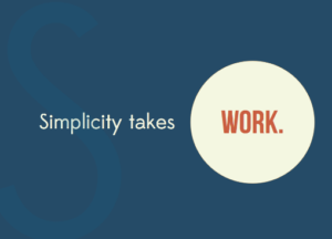
Have a simple powerpoint design.
Remove the unnecessary
This applies to the content of your talk and also to the visuals you use. Cutting the superfluous is one of the hardest things to do because when we are close to the topic, as most presenters are, it *all* seems important. It may be true that it’s all important, but when you have only ten minutes or an hour, you have to make hard choices of inclusion and exclusion. This is something professional storytellers know very well. What is included must be included for a good reason. I’m quite fond of the advice by the legendary writer Anton Chekhov: “Remove everything that has no relevance to the story. If you say in the first chapter that there is a rifle hanging on the wall, in the second or third chapter it absolutely must go off. If it’s not going to be fired, it shouldn’t be hanging there.”
Emphasis
It is important to have some element of your design that stands out and grabs the attention of your audience. You can do this by using the size, color or placement of the object to increase the focus on a certain part. To select the element of design to emphasize, ask yourself: What is the most important feature of this slide?
To add emphasis, make your text bolder, an image larger or use a color brighter than your base.
Make them feel
Storytellers—filmmakers, novelists, etc. — know that it is an emotion which impacts people most profoundly. Yes, facts, events, structure are important, but what people remember, and what is more likely to push them to act, is the way the narrative made them feel.
Balance
There are two types of balance: symmetrical and asymmetrical.
Symmetrical balance: with this type of balance the elements on both sides of the design are in similar location and size. If you were to draw a line down the middle of a symmetrical design, it would be a mirrored image on both sides. An example of this would be the human face.
You can use this technique by making sure lettering, images, and other elements are aligned and equally weighted on both sides of a slide.
Asymmetrical balance: each side of the design is different, yet still balanced. For example. You could have one large box on the left side and several smaller boxes on the right. This kind of balance creates a more visually intriguing dynamic on a slide.
Incorporate asymmetrical design by using larger visual elements in one area of the space, until the place you want the viewer to focus on is featured.
Movement
Designers often use curved lines to instill a sense of motion and to encourage the eye to move sequentially from one point to the next. This can be an important tool when you are trying to move an audience through a story, or present a series of information on a slide.
Custom background
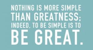
A simple presentation example.
PowerPoint and Keynote both come with a selection of nice backgrounds to choose from. Used appropriately, they can be the perfect backdrop for your presentation. However, they all share the disadvantage of being available to everyone who uses PowerPoint or Keynote. This means they might be boring—and you want your presentation to be unique.
So, choose a custom background for your slides. Some important factors to keep in mind when choosing a custom background include:
Uniqueness, but also subtlety, so your background doesn’t distract from the message
Cohesion with the presentation environment (if you know what it will look like)
The focus of the presentation – whether the background should highlight the words of the talk, or call attention to images
So where can you get a custom background? One place to look is stock photo sites, like istockphotoor Shutterstock. They have thousands of textures and gradients for sale, many of which would make an excellent background for your presentation.
Unity
Your design should always feel unified so that all of your slides are connected visually, and your deck has a consistent look and feel. The elements on your page must relate to one another through design elements such as color, shape, texture and so on. For example, if the elements on the page feel like they were placed without purpose, then your design will feel scattered, and your audience will likely be confused about the tone of your message.
Simple presentation slides: use transitions
If you’ve watched TED talks online, you’ve probably noticed that their presentations include some subtle transitions and a small animation or two. If the presentation was designed well, you probably felt the transitions in the TED Talk slides but didn’t notice them.
Can you imagine engaging with the speaker’s voice while words are zipping and flying back and forth on the screen? Sadly, you probably can. Instead of focusing on animation, use a small amount of movement to add something subtle to the whole presentation.
While animations and transitions can help, if you feel your animations don’t add something positive to your presentation, you’re probably better off taking them out.
Image design
If you want to go straight to a resource that makes images available for slides, check out a site like Pixabay, which offers images that can be used and reused commercially for free—without needing to pay for any special license. You can also check out a resource like PresentationPro, which offers a PowerPoint Graphics Pack for purchase and includes many royalty-free graphics and images that you can use throughout your presentation slides.
If you’ve followed these to edit your talk presentation, you probably found that the “makeover” to your slides was pretty simple and didn’t take too much time. Luckily, however, even these small improvements will make a dramatic impact on the result. Keep these tips in mind the next time you need to “clean up” your presentation slides.
The bottom line
Developing an eye for these different design elements can be learned, and there are plenty of resources online that can help guide you along. Think of the overall elements of design as a way to edit down the visual pieces of your existing presentation to organize and make them more cohesive. Next time you work on a presentation, go through this list and check off the elements it has. Then, try to incorporate any missing pieces in your next draft.
Need some help in capturing more customers from your social media marketing or advertising? Creative ideas to help the differentiation with your customers?
Call today for a FREE consultation or a FREE quote. Learn about some options to scope your job.
Call Mike at 607-725-8240.
All you get is what you bring to the fight. And that fight gets better every day you learn and apply new ideas.
When things are not what you want them to be, what’s most important is your next step. Call today.
Test. Learn. Improve. Repeat.
Do you have a lesson about making your advertising better you can share with this community? Have any questions or comments to add in the section below?
Digital Spark Marketing will stretch your thinking and your ability to adapt to change. We also provide some fun and inspiration along the way. Call us for a free quote today. You will be amazed how reasonable we will be.
More reading on social media marketing and advertising from Digital Spark Marketing’s Library:
Network Connection … 23 Actionable Tips for Relationships
Mike Schoultz is a digital marketing and customer service expert. With 48 years of business experience, he consults on and writes about topics to help improve the performance of the small business. Find him on G+, Facebook, Twitter, Digital Spark Marketing, and LinkedIn.