advertisements

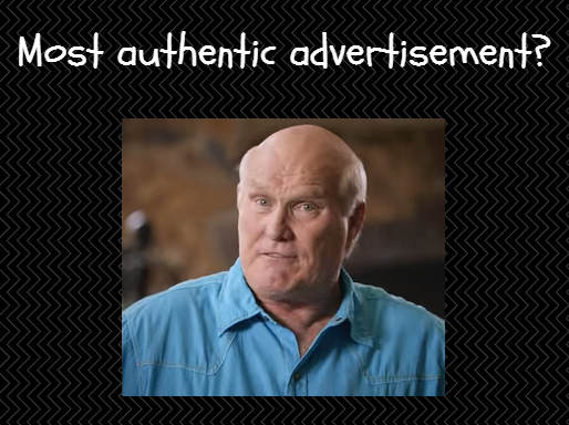
Is This Advertisement the Most Authentic Design Ever?

What do you feel is the single most significant factor in the design of advertisements? Being a most authentic advertisement design is probably not the top factor, but it is certainly in the top 5, don’t you think? It certainly influences the action taken considerably.

Related post: Insurance Advertising War … 8 Examples to Learn From


Check out our thoughts on creative marketing.


We like to examine advertisements to learn what drives the best ones to be the best and the terrible things to be that bad. Today we will examine one of the best we have seen in a while. Perhaps one that is the most authentic we have ever seen.


Here is the commercial we will discuss in this article:

Terry Bradshaw talks Shingles (Watch it here, it is only 60 seconds)

https://www.youtube.com/watch?v=KSI2AZQmEsU


It is a simple concept. People don’t read ads; they read what interests them. So if you are going to create compelling and persuasive advertising, you are going to have to create something interesting that will help consumers want to read.


Have you occasionally watched extraordinary commercials that totally captivated you? Not too often, you say? But still, it happens, doesn’t it? David Freemantle says a lot of the captivation is about feelings and simple, meaningful messages.


This commercial is very authentic in our view. Here are the seven main reasons that make it that way:


Built on emotion

There are no better means of influence or the power of persuasion than emotion. Hands down the best, in our opinion.

Experiences that trigger our emotions are saved and consolidated in lasting memory because the emotions generated by the experiences signal our brains that the skills are important to remember.

Terry evokes lots of emotion in several ways here, doesn’t he?

 
visual analogy
Do you use the visual analogy?

Create an impressive visual analogy

 Look for ways to illustrate your messages with visualization. Visual similarities are even better. An excellent example of this technique is here in this commercial with the illustration of the blindside analogy.

Based on real world experience

Bradshaw has been on both sides of this analogy experience, and that helps immensely with his credibility and authenticity. Some would say it is what makes the commercial so useful.

Popular advertisements … trusted personality

Many, many people know and respect Terry Bradshaw. He is someone who is very trusted. That also adds to his credibility and authenticity, doesn’t it?


Advertisements … make your messages simple 

Make the message as clean and straightforward as possible. You cannot overachieve on the simplicity of the message. A message that the reader will quickly understand.

 Superb visuals and visuals were so simple that you quickly grasp them and don’t lose interest. Keep in mind that pictures are far more valuable than words.

Creating customer interest does not get any simpler than this, does it? A very simple, yet entertaining design, don’t you think?
 
 
target market
Do you know your target market

Be relevant to your target market 

Keep in mind that one message does not fit all. It starts with understanding who your target customers are. In this case, the target customers are senior citizens, usually ages 60 and over. Terry is currently 67. Certainly relevant to this market on both counts.

Related post: Successful Advertisement Design … 12 Best Examples to Study

Advertisement examples … no selling

Watch the commercial carefully. Is there any trading occurring? None, absolutely none, as this is a strict infomercial. Good strategy, isn’t it?


The bottom line

I’m not as much surprised as saddened that such nutty beliefs and misconceptions about advertising (and marketing overall) can lead otherwise smart, creative people to squander their effort, money, and the patience of would-be consumers.


I’m sure there are binders full of a rationale for why it’s stunningly brilliant stuff, and there’ll be metrics that declare the spot a wild success.

But believing those arguments, or valuing those outcomes, requires that you swallow the message hook line and sinker. Not me. I’ll stick with tried and true marketing messages using the techniques in this infomercial.

 
ad_strategy
 

So if you remember one thing from this article, remember this:


Marketing or advertising, you need to create information that your customers find interesting and worth talking about and remembering. And stand for things that potential customers value.


We believe an effective ad is interesting, entertaining, and stands for things viewers can stand behind. We think it is persuasive and certainly, creates the right kind of conversation.


What do you think?


Heard enough? I rest my case.


Need some help in capturing more customers from your advertising? Creative ideas to help the differentiation with your customers?


All you get is what you bring to the fight. And that fight gets better every day you learn and apply new ideas.


When things are not what you want them to be, what’s most important is your next step. Call today.


Test. Learn. Improve. Repeat.


Are you devoting enough energy to improving your advertising design?


 Do you have a lesson about making your innovation better you can share with this community? Have any questions or comments to add in the section below?


Mike Schoultz is the founder of Digital Spark Marketing, a digital marketing and customer service agency. With 40 years of business experience, he blogs on topics that relate to improving the performance of your business. Find him on Twitter, and LinkedIn.  


More reading on marketing strategy from Digital Spark Marketing’s Library:

Ogilvy on Advertising … Best Lessons Learned from his Secrets

Volkswagen Ad … The Secrets to Its Effectiveness?

Effective Advertising … 14 Best Examples of Ad Design

Use 8 Breathtaking Commercials That Employ Emotional Appeal


Digital Spark Marketing will stretch your thinking and your ability to adapt to change.  We also provide some fun and inspiration along the way.