Whether it’s trying a new format or illustration style, there are plenty of ways to push creative boundaries. Luckily designers and infographic creators around the world continue to impress, year after year.
We believe good work should always be celebrated, and we love a good design roundup, so we’ve collected some of the most interesting and inspiring infographic design techniques.
If users digest messages and take action that much more when accompanied by a visual then why not turn your marketing content into visual content?
Infographics can be a highly effective way to get your content out into the digital in this way and engage your audience than with text alone.
But how do you make sure that yours is more than just another pretty image? I’ve put together design techniques that I use when designing an infographic that will help you plan and design an infographic that will truly captivate your audience and have them share it with their friends and peers.
Know your audience
This goes hand-in-hand with your content. Just as with any great piece of marketing content, you have to design with your target audience in mind. You could design a really fantastic infographic, but it won’t perform if it doesn’t resonate with your audience.
For example… Does your audience value getting quick information? Great, keep it short and sweet with icons, bullet points, and simple headers. You want to get right to it. Is your audience older? No problem, just be careful of your typesetting to make sure it is highly legible (i.e. Keep font sizes on the larger side. Use contrasting colors to make it more defined and easier to read).
Is your audience data or numbers-driven? Highlight percentages, stats, and real numbers!
Study the competition
One of the very first things to do when I sit down to start an infographic is to browse inspiration. This will help to put you in the right mindset and will also (hopefully) give you some ideas of the best direction to go in.
If you have final content, make note of layouts that have a similar structure to your content are doing it well. Is it engaging? Does it use visual cues to move the user down through the content? How is the content broken up?
If you don’t have final content, this is a good time to see what lengths of content are captivating and keep the user engaged and build your own wireframe around that.
You may also want to take a look at what people in your industry are doing. This can give you a good idea of what your audience is looking for visually or what content your audience may crave.
There are way too many sites you could check out for inspiration but here are a few of my favorite haunts:
This seems pretty obvious, but I really can’t say it enough. If the content of your infographic is thoughtful and helpful, people will read it. If you throw together some random words just to get an infographic out there, that will translate to the final product.
Quality over quantity, always. This goes for the content itself as well, no need to overwhelm the viewer with dozens of points, when you can get the job done with 5 or 6 really powerful points.
Build a wireframe
Okay, we all know when designing a web page to start with a wireframe, so why are we not doing this for infographics? Hopping right into the design of your infographic without planning out the layout will only cause you more headaches.
Let’s slow it down to speed it up.
Create a wireframe that includes your content outline, or better yet final content, and start planning where images, icons, dividers, etc. will go.
This is not only a great way to start visualizing your infographic personally, but it’s an AWESOME way to collaborate and ensure buy-in from your team before you put too many hours into the project.
Do a wireframe and review it with your client or team. If something isn’t sitting right structurally or content-wise, this gives you a chance to pivot before you’re in too deep.
If you’re unsure of where to start when creating a wireframe for an infographic take a look at this layout cheat sheet from Piktochart.
Show, don’t tell
Infographics should be just that — graphic. With this medium, it is more powerful to show the point visually through icons or images than to write it out.
Here’s a really fun example from Ziploc that deconstructs ramen hack recipes visually.
This infographic could be in another language entirely and it would be just as engaging. View the full infographic here.
Don’t over-design it just for the sake of it. Just as with any web design make your visuals purposeful. If it’s not adding to the final product or serving some kind of purpose, then it has no business being in your infographic.
Some of the best infographics take a minimalist approach, and if you can captivate your audience with less design/content/flourish then why the heck not!
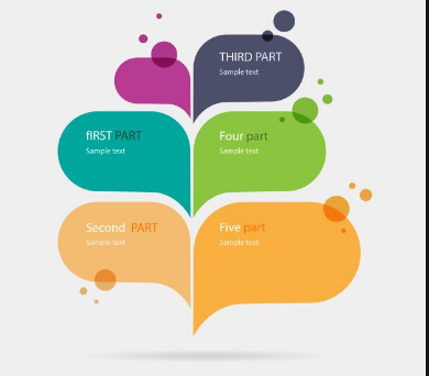
Break it up
Maybe you have a ton of content, or maybe you’ve kept it a bit leaner. Either way, you are going to want to break up your content into bite-sized morsels. Displaying proper hierarchy among your text will help your user determine what is important, what they can quickly scan, and the rhythm of the content.
Break it up.
I think some of us have grown accustomed to infographics being these extremely intricate designs where when thing flows directly into the next and whitespace is nowhere to be found. This might actually be causing your users to miss key information and lose interest. Whitespace is essential to readability, allowing your user’s eye to rest and contributing to the hierarchy of the text.
Create vertical movement
We all know that a basic infographic is usually taller than it is wide, this means it is super important for you to guide your user down through the content. There are many subtle ways you can do this. Some of my favorites include arrows, directional lines, diagonally divided backgrounds, and backgrounds that overlap between two sections.
This infographic by designer, Brianne Boland, is a perfect example of using directional lines and arrows to guide the user.
See the full thing and others in the same series here.
Credit your work
If your infographic is data-heavy chances are you have the sources to back them (or you should) and if you got ‘em flaunt ‘em, baby.
This adds credibility to your content that users will definitely appreciate. You have 2 basic options when doing this. Include URLs or citations through the content or have a sources section in the proverbial footer of your infographic. These shouldn’t distract from your content or the design but should be subtle and seamless.
Check out how this design from Red Website Design incorporates them into the footer area. Check out the full design here.
Make it shareable
You’ve put all this work into crafting a freaking awesome infographic that your audience is going to love, and if they love it maybe they have friends and colleagues that will too!
Make it easy for them to share this content by incorporating social sharing buttons into your design. I should note that this will only work if you are sharing your infographic as a PDF, you can link PDFs but not a JPEG, so always check how you are rendering it.
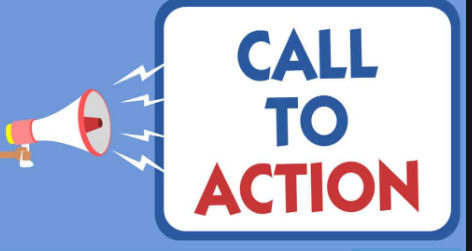
Don’t forget the call-to-action
A fatal flaw I see far too often is not including a call-to-action.
Call-to-action
Your infographic should tell be part of a journey, so the next steps should always be included. Consider what would be the next logical move for the reader with your brand. Are they looking for more information? Are they ready to talk to someone? Would they benefit from a demo?
Again, if you are sharing as a PDF you can just create a linked actionable button like “Get Your Demo Now” or “Talk to Us” but even if you are sharing as a JPEG, I would still recommend wrapping up with verbal guidance.
You can even consider creating a visual button or adding a shortened URL, so the user can easily type that into their browser.
Finally, make it repeatable
This may seem contradictory to the quality over quantity rule, but if you have a lot of content that you’d like to turn into visual content and not a lot of design resources (like limited access to a designer). Consider creating a template of sorts where the basic infographic does not change much, but the content can be easily swapped.
This format works best for chart style content that gives users numbers and comparisons that are easily digestible.
This is also helpful for creating visual brand consistency across everything you share.
The bottom line
Stick with these ideas and you’ll be sure to have a successful infographic! Don’t be afraid to mix it up from one to the next. If your last infographic isn’t performing how you’d hoped, take a look at what may not have struck a chord.
There is a reason why some change leaders succeed while others fail. At some point everybody needs to decide whether they would rather make a point or make a difference and, in the end, those that prevail choose the latter.
Is there too much content? Not enough visualization? Did it not get many views, maybe the title needs work. Ask yourself all of these questions and don’t be afraid to try a different approach.