A famous Godin quote: Products that are remarkable get talked about. Remarkable is a word many marketers are familiar with. Especially those that are fans of Seth Godin. Seth has written a lot about remarkable and designing a brand identity.
Check out our thoughts on creative marketing.

Remarkable … it’s something brands around the world are trying to be.
Being noticed is not the same thing as being remarkable. Seth Godin talks about how running down the street naked will get you noticed, but it won’t accomplish much. It’s easy to pull off a stunt, but it’s not useful.
Your brand doesn’t need to do crazy things to grab attention. And certainly not to be remarkable. You don’t want to border the line of insane and outlandish.
Related post: Walmart E-commerce Strategy … 6 Reasons Why It Won’t Beat Amazon
In his book, Purple Cow, Seth Godin talks about how remarkability lies on the edges. The biggest, fastest, slowest, richest, easiest, most difficult. It doesn’t usually matter which edge, it matters more than you’re at (or beyond) the edge.
Here is the thing: don’t follow in the footsteps of other businesses. If you do, you’ll find that your marketing is boring.
Remarkable isn’t about fitting in; it’s about standing out and making a difference.
Being innovative drives remarkable design, doesn’t it?
I don’t know about you, but it’s hard to ignore a brand that’s pushing the envelope, getting their name out in the open … being innovative.
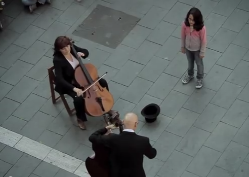
Have you seen the remarkable branding video design from this Spanish bank? The video was created to celebrate the 130th anniversary of Banco de Sabadell, which is in a city in Catalonia, Spain.
It is a very simple story. A little girl puts a coin in the troubadour’s hat. He then starts playing Beethoven’s Ode to Joy. Then the magic begins. If you haven’t seen it, watch it now, it is only 5 minutes and it will inspire you.
http://www.youtube.com/watch?v=GBaHPND2QJg
What makes this branding so remarkable?
Of course, the whole thing was staged. Who cares? It certainly accomplished its objective to build on the brand. Over 16 million views so far. And it has engaged its audience to the tune of more than 10 thousand comments.
Pretty remarkable in itself. Of course, you can’t design for going viral. But you can target for being remarkable and engaging.
How do you rise above the noise and really stand out? It’s getting more and more difficult. But it’s still possible. Here are the remarkable branding design elements from this video.
Designing brand identity … emotional triggers
Not a real secret here. The music that is created, while familiar, is as distinctive as it is heartwarming. Watching the faces, actions, and passions of the crowd draws you into the emotion.

Creates curiosity
If this was just the entire gang doing the music from the beginning, there would be no curiosity. And with no curiosity, there would be lots less interest maintained. Creating curiosity is a great way to draw and hold attention. It is way underutilized as a branding or marketing technique.
Fun and entertaining
Here’s a piece of music that we’ve all heard a million times. While we have all heard this music before, its incremental build-up production in this video, when combined with the other design elements, really adds to the fun and entertainment.
In the context of the public sidewalk and street, it’s as if you’re hearing this old song in a new way. With new ears.

Designing brand identity review … an unspoken message
The video is presented as a gift. It asks for nothing in return. There’s no call to action. Sometimes, unspoken messages carry the message the best. This video is in recognition of the bank’s 130 year anniversary. 130 years says secure, doesn’t it? Says we’ll always be here for you. Both with no voice or written message.
Very effective. Note that the bank’s brand is visible in the background on several occasions. Subtle, very subtle. All during the film, you keep seeing the Sabadell bank in the background. Then at the end, there’s an explanation.
The creators don’t try to pretend that this has nothing to do with their brand. They brand is part of the story. The brand placement doesn’t overwhelm the video, but it should be present.
Designing brand identity … screams to be shared
Here is the thing. When things are remarkable, it is something you want to share with your friends. But going viral is much more difficult to predict. This video was released in 2012 but didn’t go viral until this year. Interesting how certain influencers engage and create change in viewing.
Related post: Brand Management … 12 Ways to Humanize the Brand to Build Trust
Remarkable isn’t always the same. Get in the habit of doing the “unsafe” thing every time you have the opportunity is the best way to see what’s working and what’s not.
The bottom line
The key to being remembered is being remarkable. Don’t let your brand take the back seat, stand out.

