Leo Burnett once said: The secret of all effective advertising is not the creation of new and tricky words and pictures, but one of putting familiar words and pictures into new relationships. It is a simple concept. People don’t read ads, they read what interests them. So if you are going to design brilliant ads, you are going to have to create an interesting copy.
And, oh, by the way, it must be more interesting than the millions of other advertisements out there. Now that is a daunting task, isn’t it?

Check out our thoughts on creative marketing.
Check this out: Volkswagen Ad … The Secrets to Its Effectiveness?
It has been said that advertising is the price to be paid for being unremarkable. That may be true, but I have noticed, despite the growth in online marketing, that even remarkable businesses also advertise the old fashion way.
It is a key component of your marketing campaign, for awareness or consumer education of your value.
According to Nielsen, there are 27,000,000 pieces of content are shared each day. And Statistic Brain says that our average attention span has dropped from 12 seconds in 2000 to 8 seconds – one second less than a goldfish!
We check our phones 150 times per day. We check our email up to 30 times an hour. And the amount of information in the world continues to double every 18 months.
All this available information and data is creating a battle for customer attention between brands, publishers, and every one of us who creates content. But more importantly, its forcing businesses to think and act like publishers and creative designers.
Ever written an advertisement, or thought about it? I’ve done marketing for my clients in small businesses for the past 4+ years and I’ve learned a few things about making advertising look professional even on a tight budget. Many small businesses don’t have a lot of time or resources to have ads professionally made. So what’s a small business to do?
If everyone is creating content, how does a business break through the noise? How do we reach our customers in a way that engages them?
The role of a great publisher is not to predict what readers may want to read, but to help them form their opinions through strong, authoritative journalism. You win in the marketplace not by chasing readers with algorithms, but by attracting them with a superior product. Great journalism can’t be automated, because it is among the most human of endeavors.
Here are 10 important enablers we rely on to create effective advertisements that can do both:
Design brilliant ads … strategy
Before undertaking the design of an advertisement campaign, consider the following:
What would you like to accomplish with your ad campaign?
What are you offering to your potential customer?
Why is your product or service unique?
All of these questions are essential to defining the advertising strategy. Here are some additional factors to consider:
Target the end state values to your customers
A good example of this is Dell’s fast delivery of a custom computer.
Be relevant to your target market.
Keep in mind that one message does not fit all. It starts with knowing the insights of your target market.
Define your positioning
Your positioning is the frame of reference. Make comparisons to your competitors if you can.
Clearly, link your messages
Link your messages to your brand. Remember the AFLAC duck or E-Trade’s talking baby … these are great linkages to the brands.
Messages and content
Use simple messages complemented with powerful visuals
Make your messages simple
So simple that the reader will quickly understand. Keep in mind that pictures are far more valuable than words.
Your Logo
If your business’s logo/name doesn’t contain what you do, make sure to clarify that in the ad. For example, saying “Ron’s European Inc. Collision Repair” instead of just “Ron’s Inc.”
Add information about what your business does and how you intend to help your potential customers.
Less is more
Don’t overwhelm people with information. Keep it as simple as possible while getting useful information across to the viewer.
You only have a few moments to communicate, so use powerful, focused, and simple words – such as ‘free’, ‘unbelievable’, etc.
Use easy arguments
Easy arguments are the conclusions people reach using inferences without a careful review of available information. Find and use easy arguments that work because it is almost impossible to succeed when working against them.
Optimize the content
A call to action is crucial. Make it large and prominent to catch give the viewer’s an incentive.
Keep your message personalized – address it to one person, not to masses of people.
Ask a question to get the viewer thinking.
Give the readers a reason to act right away (for example – ‘today only’).
Use testimonials.
Make it easy for the customer to reach you. Add the telephone number, mailing address, and the web address
Here is an example where the heading is very misleading. Do parent immunize their children to “help the community?” It’s a noble thought but entirely unrealistic for those outside the healthcare profession. Parents are concerned about their children’s welfare and their immediate family’s far more than the communities.
The use of the word “flatline” subconsciously associates vaccinations with death. It’s not about killing the flu. It’s about gaining peace of mind, and feeling like you’re making the right choices as a parent.
Brilliant ads … appeal and attention
The present appeal that grabs consumer attention
Grab and hold viewers’ attention
Interesting information is the foundation. Your ad messages must be appealing to your target communities.
Headlines are the first place for attention
Here are techniques that we have found to be most effective:
Be newsworthy
Define your benefit
Ask a question
Create curiosity
Variation is key
Use multiple creatives for an ad campaign. Our best performing campaigns are the ones that change banner creative often. We highly encourage new creative every couple of weeks for a fresh new look, and to decrease burnout.
According to John Caples’ book, Tested Advertising Methods, there are three classes of successful headlines:
Self-interest Headlines
This headline appeals to the reader’s self-interest and contains a personal benefit to the reader. These are the best performers.
News Headlines
They add something new and are rated the next best.
Curiosity Headlines
Rated third best, they arouse curiosity. For curiosity headlines to be most effective combined with self-interest or news.
This Samsonite ad lacks any sort of story, any sort of coherence, or any sort of relevance The entire idea is a non sequitur — two things that shouldn’t go together, but which are smashed into the same space. The idea of professional hockey players using luggage in the place of sticks is absurd, and since the ad is meant to be flashy, not humorous, the absurdity makes no sense whatsoever.
And the image itself is very poorly done. It’s not the worst national ad campaign we’ve ever seen, but it’s certainly a good example of a bad ad.
Creative ads … visual elements
Visual elements should be part of the story
Support your messages with visual elements like a photo or graphics. This can be your logo, a picture of your business, or a graphic to support your messages.
Show and don’t tell
“Seeing is believing” and “actions speak louder than words” are two common sayings that reflect a bias and preference for visual presentation.
Use symbolic language and images that relate to the senses?
People prefer symbolic language and images that relate to the senses. People are far less receptive and responsive to language and images that relate to concepts. Life is experienced through the senses and using symbolic language and images that express what people feel, see, hear, smell or taste are easier for people to understand, even when used to describe abstract concepts.
Use powerful videos to convey your messages
The truth is that the processing capacity of our brains is limited and words may get in the way of emotionally powerful visual images. When powerful visual images dominate – when “a picture or video is worth a thousand words” – be quiet and let them do the talking.
Articles with images get 94% more views than those without. And posts with videos attract 3X more inbound links than plain text posts. A study by 3M showed that 90% of the information sent to the brain is visual, and visuals are processed 60,000 times faster than text.
And this holds up when you look at how the social world is evolving. The meteoric rise of sites like Vine, Instagram, and Pinterest, as well as the efforts by Facebook and Twitter to add more visual elements to their platforms, are simply following the trend that visual content is the best way to reach short-attention-span audiences in a world filled with so many content choices.
McDonald’s is constantly coming up with innovative new ways of advertising, this brilliant print ad being its latest offering. The eye-catching visual design features a box of fries, carved from the very ingredient from which they’re made. Simple but conveying a powerful yet memorable message.
Emotional influence
Create emotional influence wherever you can
Tell a simple story that evokes emotion
A good story has a beginning where a sympathetic character encounters a complicating situation, a middle where the character confronts and attempts to resolve the situation, and an end where the outcome is revealed.
A good story does not interpret or explain the action in the story for the audience. Instead, a good story allows each member of the audience to interpret the story as he or she understands the action. This is why people find good stories so appealing and why they find advertising that simply conveys information boring.
Convey basic emotional appeal
Experiences that trigger our emotions are saved and consolidated in lasting memory because the emotions generated by the experiences signal our brains that the experiences are important to remember.
There are eight basic, universal emotions – joy, surprise, anticipation, acceptance, fear, anger, sadness, and disgust. Successful appeals to these basic emotions consolidate stories and the desired calls to action in the lasting memories of audiences.
Design and layout
The biggest design and layout mistake? Too much information.
Information hierarchy
Choose information that’s most important and make it your main element of the ad. Every piece of information in your ad should be weighted according to its importance. Make sure it is prioritized from most critical to least.
Use space wisely
Don’t use every inch of white space because you can. Leave some “breathing room” so people can digest your message. We believe the more the better.
Use contrasting colors for fonts and backgrounds to make sure that your copy is readable. The best combo is dark type on a light background so it’s easier to read.
Fonts, fonts, and fonts
Use mostly sans-serif fonts and use different font sizes to differentiate the importance of the copy. Avoid using too many font types or too many font colors (think one or two max). A little color and a lot of white space go a long way.
The layout makes a difference
Be sure that your ads flow from left to right (as the eye travels left to right)
Pay attention to color schemes … avoid designs that are too busy
The size of the headline font should be big, and powerful enough to grab the attention of the reader.
This hard-hitting print ad aims to raise awareness of child labor… a simple but effective offering. Two things that could use some improvement, however: The ad is in black and white (when all the other ads on the page were color) and most of the fonts are the same size and too small. By adding color and font size increase and variation, they could have really spiced things up!
Effective value proposition
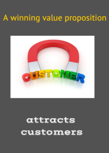
Sometimes the value proposition is the packaging, not the product.
Define a value proposition that truly discriminates you from your competition. It is essential that you give your customers reasons to select you. It is amazing to us that many campaigns neglect this.
Identifiable music
Match what viewers see with what they hear
People expect and prefer coordinated audio and visual messages because those messages are easier to process and understand. Audio and visual messages that are out-of-sync may gain attention, but customers find them uncomfortable.
Identifiable music
Music can be a rapidly identified cue for the recall of emotional responses remembered from previous advertising. Making the same music an identifiable aspect of all advertising signals the audience to pay attention to more important content.
A great TV ad by Dell that celebrates new business startup successes. Check out this memorable music that does a fantastic job of complementing the ad’s messages … ‘this magic moment’.
http://www.youtube.com/watch?v=Ja61fxmY77Q
Brilliant advertisements need a call to action
A simple call to action is needed on all ads.
Say exactly why people should contact your business and what you can do for them. For example “Come home to a life that is SIMPLY MAGNIFICENT.”
Make the desired call to action a part of the story
A good story that is very entertaining but does not make a direct connection between the desired call to action and the story is just a very entertaining story. The whole point of the story in advertising is to effectively deliver the desired call to action.
If the audience does not clearly understand the desired call to action after seeing the ad, then you are missing the real opportunity. Remember this: having an entertaining story and clearly delivering the desired call to action are not mutually exclusive.
Part of an integrated marketing campaign
Make your ad a component of an integrated marketing campaign.
It’s key to have social integration across all areas of the business. Social media is a tool to be used across all functions: HR, sales, marketing, product design, online, and customer support. Look for how all areas of social (listening, research, support, content, and analytics) come together to have an impact on customer experience and employee collaboration.
Embed social media in the fabric of the company and empower your employees to use it to achieve better results for customers and the business. This is the best way to create an integration in your marketing.
So if you remember one thing from this article, remember this:
Marketing or advertising, you need to create information that your customers find interesting and worth talking about and remembering.
The bottom line
That’s the power of a good story. It provokes thought and discussion. It holds our attention because we want to see how it ends.
Instead of a canned, linear sequence of events, we enter an unfamiliar world that surprises us and teaches us something. We genuinely don’t know how things will turn out.
