What we see … depends on what we look for. Do you have an interest in data visualization design? A critically important skill these days, and quickly growing in importance. Here is an interesting quote from Google chief economist, Hal Varian:

The ability to take data – to be able to understand it, to process it, to extract value from it, to visualize it, to communicate it, is going to be hugely important skill in the next decade.
Check out our thoughts on building innovation.
Data visualization is the study of the visual representation of data. Simply put, this means information that has been abstracted in some schematic form.
According to Friedman (2008):
The main goal of data visualization is to communicate information clearly and effectively through graphical means. It doesn’t mean that data visualization needs to look boring to be functional or extremely sophisticated to look beautiful. To convey ideas effectively, both aesthetic form and functionality need to go hand in hand, providing insights into a rather sparse and complex data set by communicating its key-aspects in a more intuitive way. Yet designers often fail to achieve a balance between form and function, creating gorgeous data visualizations which fail to serve their main purpose — to communicate information.
I could not agree more. To keep up and continuously learn this skill, I have found 5 favorite extraordinary examples of data visualization that provide tons of new design insights.
The ultimate goal of all the points I list below is this: eliminate the fluff from your marketing strategy and focus only on the things that work.
I will share them and why I like them so much:

Visualization … tells a story
This visualization starts out with the commentator asking people a simple, yet thoughtful question:
How much money do you have in your pocket right now?
After he collects everyone’s answer, he asks a second, more probing question:
Could something that small make an impact on something as big as your retirement goal?
Most people have less than $50 in their pockets and don’t believe this amount of money could significantly impact their retirement goal. Now to make this point with a visual analogy, the commentator points to a series of dominoes, smallest to largest. When he makes his point on putting away investments consistently over time, he knocks over the smallest domino, which causes the chain reaction to topple all the dominoes. A great analogy to the retirement goal being achieved … as the dominoes fall the emotion rises.
A good emotional story provides a very good connection between the issue and the company promoting their message. The ad does explain the action in the story to the audience. And it allows each member of the audience to interpret the story as he or she understands the action and the emotion. If you would like to see a behind-the-scenes 3-minute video on the making of this visualization, you can check it out here.
This is why people find good stories so appealing and why they find advertising that simply conveys information boring.
Visualization data … world income distribution
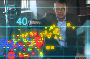
Hans Rosling is a Swedish medical doctor, academic, statistician, and public speaker. He is a Professor of International Health at Karolinska Institute and co-founder and chairman of the Gapminder Foundation. What sets Rosling apart isn’t just his apt observations of broad social and economic trends, but the stunning way he presents them.
Guaranteed: You’ve never seen stories with data presented like this.
His story is an interactive display of statistics on household income distribution for Bangladesh, Brazil, China, India, Indonesia, Japan, Nigeria, Pakistan, and the USA and the World as a whole each year from 1970 to 1998.
Check out this video:
Stats That Reshape Your World View

Show scale
The universe is vast. Anyone who’s ever looked up at the stars and felt sudden sweeping insignificance can tell you that. But getting a true sense of that vastness can be hard.
There are entities, large and small, that are just beyond the grasp of our imagination — unless, of course, visualization helps you take cognitive baby steps.
Nikon’s Universe Scale
An illuminating interactive, Nikon’s Universe Scale attempts to give viewers an “infinite yardstick” by which to understand the relative scale of objects large and small. It starts with commonly known objects — a ball, an ostrich — then allows the viewer to pan out to entities as large as the group of galaxies to which the milky way belongs and those as small as quarks.
The movement between items allows for a sense of distance between their relative sizes and helps the viewer grasp the scale of the wildly vast and the infinitesimally small.
Try it out.
Underscore trends
Change, like scale, can be a hard concept to fully grasp. Often change happens slowly, consistently, and without many affairs. Even sweeping change can be so gradual you can hardly discern it is taking place.
By collapsing change into a single graphic, or speeding up the passage of time, data visualizations help us better see the trends at play.
Plenty More Fish in the Sea?
Visualization doesn’t have to be complex to be high-impact. Commissioned by The Pew Charitable Trusts as part of European Fish Week, “Plenty More Fish in the Sea?” shows the drastic reduction in the population of popularly-eaten fish in one striking image.
It doesn’t take much to look at this image and conclude that something significant has happened here.
See the full-sized image.
Data visualization … show how things work
Sometimes to understand a complex situation, you have to break it down into parts. This visualization helps the viewer deconstruct an idea to build an understanding of it piece by piece.
Key players and notable relationships in the Middle East
To say that the relationships in and surrounding the Middle East are complex would be a sizable understatement. It is impossible however to fully understand the political climate, decisions, and points of conflict that exist in the Middle East without having a sense of the relationships that inform them.
This still-evolving interactive visualization from David McCandless and UniversLab attempt to map the relationships among the nations and groups that shape the Middle East. Clicking on a country or group reveals its known allies and foes.
The bottom line
The study and practice of data visualization have grown significantly over recent years as technology has made it easier to map data in more sophisticated ways. As data visualization has grown, it has opened up more possibilities for the way we communicate complex ideas and help viewers experience stories.
The examples featured here are just the tip of the iceberg. Most of these visualizations are vast and many are interactive.

