Swiffer Marketing Strategy is Employing the Power of Persuasion

It is a simple concept. People don’t read ads, they read what interests them. So if you are going to generate advertising and design, you are going to have to create a power of persuasion copy. And, oh, by the way, it must be more interesting than the millions of other advertisements out there. Now that is a daunting task, isn’t it? The Swiffer marketing strategy has overcome this dilemma by employing the power of persuasion that encourages the right sort of conversations.

employing the power of persuasion
Employing the power of persuasion.

Related post: How to Frame Marketing Messages for Optimum Engagement

Conversations among the members of your marketplace happen whether you like it or not. Good marketing encourages the right sort of conversations.

-Seth Godin

According to Nielsen, there are 27,000,000 pieces of content are shared each day.  And Statistic Brain says that our average attention span has dropped from 12 seconds in 2000 to 8 seconds – one second less than a goldfish!

We check our phones 150 times per day. We check our email up to 30 times an hour. And the amount of information in the world continues to double every 18 months.

All this available information and data is creating a battle for customer attention between brands, publishers, and every one of us who creates marketing content. But more importantly, its forcing businesses to think and act like creative designers.

It has been said that advertising is the price to be paid for being unremarkable. That may be true, but I have noticed, despite the growth in online marketing, that even remarkable businesses also advertise the old fashion way.

It is a key component of your marketing campaign, for awareness or consumer education of your value. If everyone is creating content, how does a business break through the noise? How do we reach our customers in a way that engages them?

Let’s examine 4 Swiffer TV ads that are part of the Swiffer marketing campaign:

The first 2 TV ads use the same elderly retired couple Lee and Morty Kauffman. In the first ad, the emphasis is on certain cleaning tasks that are become more difficult for the elderly …not so safe until they are introduced to some Swiffer products.

In the second ad, the subject is about how much dirt can two people manufacture? After trying the Swiffer products they are now convinced they have been living ‘in a fool’s paradise’ thinking that their home was clean.

In the third ad, three generations of one family get into a discussion and comparison of how they did the cleaning. Lots of cultural differences in cleaning for sure.

In the final ad, the cleaning comparisons were between a young husband and wife. In this ad, the comparison comes back to safety, as the husband has recently lost one hand and can’t do as much as he used to. That is, until the introduction of Swiffer products. Some interesting targeting, eh?

Swiffer made its debut in 1999 and soon established itself as a pioneer in both the cleaning systems category and a pop culture icon. Swiffer products have starred on Saturday Night Live, featured in Hollywood blockbusters, and graced the cover of Rolling Stone Magazine.

With the support of Swiffer fans around the world, Swiffer has built a family of distinctive products built smarter than traditional cleaning tools.

So, in summary, let’s examine these TV ads in total as key to the Swiffer marketing campaign’s power of persuasion:

power of persuasion definition
Power of persuasion definition.

Shine the light on the value

Target the end state values to your customers. In this case, these ads show how cleaning can become more effective and easier at the same time. A big discriminator in this market.

Employing the power of persuasion … product positioning

Your positioning is the frame of reference. Make comparisons to your competitors if you can. The positioning in these ads is not with competitors but comparisons between the new cleaning tools and methods in comparison to the old ways.

A very effective marketing technique, don’t you think?

emotional connection
Find the emotional connection.

Emotional connection through a simple story

A good story has a beginning where a sympathetic character encounters a complicating situation, like the ability to clean the overhead lights.  A good story does not interpret or explain the action in the story for the audience.

Instead, it allows each member of the audience to interpret the story as he or she understands the action. This is why people find good stories so appealing and why they find advertising that simply conveys information boring.

Experiences that trigger our emotions are saved and consolidated in lasting memory because the emotions generated by the experiences signal our brains that the experiences are important to remember.

In these ads, the personalities of the characters add the emotions of humor, realness, surprise, fear, and even a tiny disgust.

Power of persuasion techniques … relevance to the target market

Keep in mind that one message does not fit all. It starts with knowing insights into your target market. The customer targeting in these ads has emphasized the elderly, handicapped, and different generation cultures.

Swiffer marketing strategy … make your messages simple

So simple that the reader will quickly understand. Keep in mind that pictures are far more valuable than words. Use simple messages complemented with powerful visuals. Employ easy arguments.

Easy arguments are the conclusions people reach using inferences without a careful review of available information. These ads clearly and simply get the messages by showing the before and after visuals.

Appeal and attention

Grab and hold viewers’ attention Interesting information is the foundation.  Your ad messages must be appealing to your target communities. The emphasis on emotion, in this regard, adds to the appeal and attention.

Visual elements

Visual elements make great components of the story. Support your messages with visual elements like the duster that is covered with dust to support your messages on the cleaning effectiveness. “Seeing is believing” and “actions speak louder than words” are two common sayings that reflect a bias and preference for visual presentation.

The truth is that the processing capacity of our brains is limited and words may get in the way of emotionally powerful visual images. When powerful visual images dominate – when “a picture or video is worth a thousand words” – be quiet and let them do the talking.

Articles with images get 94% more views than those without. And posts with videos attract 3X more inbound links than plain text posts.  A study by 3M showed that 90% of the information sent to the brain is visual, and visuals are processed 60,000 times faster than text.

Effective value proposition

Define a value proposition that truly discriminates you from your competition. It is essential that you give your customers reasons to select you. It is amazing to us that many campaigns neglect this. These ads certainly did not neglect this essential element.

Part of an integrated marketing campaign

Make your ad a component of an integrated marketing campaign. Proper spacing/timing are essential to the campaign. Swiffer has this element nailed in terms of ad frequency and mixing a variety of ads so as not to annoy customers.

It’s key to have social integration across all areas of the business. Social media is a tool to be used across all functions: HR, sales, marketing, product design, online, and customer support.

Look for how all areas of social (listening, research, support, content, and analytics) come together to have an impact on customer experience and employee collaboration.

Embed social media in the fabric of the company and empower your employees to use it to achieve better results for customers and the business. This is the best way to create an integration in your marketing.

The bottom line

Not everyone appreciates your efforts to use power of persuasion to be remarkable. In fact, most people don’t. So what? Most people are ostriches, heads in the sand, unable to help you anyway.

Your goal isn’t to please everyone. Your goal is to please those that actually speak up, spread the word, buy new things, or hire the talented.

Image ideas.

So if you remember one thing from this article, remember this:

Marketing or advertising, you need to create information that your customers find interesting and worth talking about and remembering. These Swiffer ads have certainly become a big success, don’t you agree?

Have any advertising experience that you would like to add to this community? Any comments or questions you like to add below?

So what’s the conclusion? The conclusion is there is no conclusion. There is only the next step. And that next step is completely up to you. But believe in the effectiveness of word of mouth marketing. And put it to good use.

It’s up to you to keep improving your creative marketing efforts. Lessons are all around you. In this case, your competitor may be providing ideas and or inspiration. But the key is in knowing that it is within you already.

All you get is what you bring to the fight. And that fight gets better every day you learn and apply new lessons.

When things go wrong, what’s most important is your next step.

Try. Learn. Improve. Repeat.

All you get is what you bring to the fight. And that fight gets better every day you learn and apply new ideas.

When things are not what you want them to be, what’s most important is your next step.

Are you devoting enough energy to improving your marketing, branding, and advertising?

Do you have a lesson about making your marketing strategy better you can share with this community? Have any questions or comments to add in the section below?

Digital Spark Marketing will stretch your thinking and your ability to adapt to change.  We also provide some fun and inspiration along the way.

More reading on marketing strategy from Digital Spark Marketing’s Library:

Case Studies to Evaluate New World Marketing Concepts

How to Frame Marketing Messages for Optimum Engagement

Some Great Story and Storytelling Examples to Study

Mike Schoultz is a digital marketing and customer service expert. With 48 years of business experience, he consults on and writes about topics to help improve the performance of small business. Find him on FacebookTwitter, Digital Spark Marketing, and LinkedIn.

Neil Patel Design Examples That Are Easy Fixes For Your Social Media

In this blog, we will define important Neil Patel design examples we rely on to create effective advertisement messages and the best examples of each that we could find. These are social media design examples.

Neil Patel design examples
Some Neil Patel design examples for social media.

If you wanted to learn more about building the best advertisements, how would you go about it? For us, the answer is pretty simple.
We learn best by studying and analyzing awesome advertisement design examples.
The secret of all effective advertising is not the creation of new and tricky words and pictures, but one of putting familiar words and pictures into new relationships.


Related: What Makes These Extraordinary Commercials so Captivating?
It is a great way to learn and stimulate design ideas. Let’s get started:
 

Neil Patel design examples … generate fan togetherness

Biltwell makes motorcycle accessories, and they also make great engagement happen on their Facebook page with some fantastic helmet art.
Check out this example of the fan helmet art they routinely highlight, which encourages fan submissions and generates a feeling of togetherness around the brand. It seems to be an ongoing campaign of Biltwell’s.


Grab and hold the attention

Did you see Nike’s Re2pect … a Tribute to Yankee Shortstop Derek Jeter? As most of us know, future Baseball Hall of Famer Derek Jeter recently retired.
So, one of Jeter’s long-time sponsors, Nike, released a commercial paying tribute to him. The ad’s name “ RE2PECT” is a tip of the cap to Jeter’s jersey number – and a host of athletes and celebrities can be seen paying tribute to the Yankees captain.
Watch this cool commercial here.


Social media design examples … use extraordinary prizes 

I think tickets to the World Cup are the single best prize that marketers could offer this year, how about you?
Hyundai teamed up with YouTube channel Copa90 for a contest with the World Cup of prizes. Check out their video.


emotional influence
An emotional influence.

Neil Patel design examples … emotional influence

The Zillow real estate company has built an entire marketing campaign on influencing home buyers with emotional influence.
Have you seen any of them? We like them so much that we have searched for them on YouTube frequently.
“Homecoming” is Zillow’s sixth TV spot, the latest in the company’s highly successful national advertising campaign. You cannot beat these ads.
There are no better means of influence or the power of persuasion than emotion. Hands down the best, in our opinion.


Experiences that trigger our emotions are saved and consolidated in lasting memory because the emotions generated by the experiences signal our brains that the experiences are important to remember.
The homecoming commercial ending message says it all:
 You are not just looking for a house; you are looking for a place for your life to happen.
 
This commercial focuses on emotional appeal grandly. It is the secret of this commercial’s success. It creates strong persuasion in our opinion. A great example of a successful advertisement design.
 

Neil Patel design examples … photo contests

If you are going to compete in a photo contest, why not compete in a grand way? National Geography launched a contest on Facebook where fans can experience the thrill of having their photo on a National Geographic magazine cover. Wow, now that is a great incentive, yes?
Fans simply upload their photos through Facebook, caption it, and they are entered to win a travel package. Seems like a great image generator that fans will also want to share on their own Facebook pages.


Neil Patel design examples … Four Seasons’ company page

Neil Patel knows one in three professionals online is on LinkedIn. How many of those are making hotel reservations around the world and spending company money? Plenty.
That’s why it’s so smart for Four Seasons to build a helpful, engaging LinkedIn presence.
They feature great videos and readable content, and they also post job listings. It’s a great example of a LinkedIn company page done well (and they were also selected as one of LinkedIn’s top company pages of 2013).


Customer end state needs

Focus on customer needs end state and not the means. The end state is the only priority.
Here is another excellent example:
That is this Prudential’s billboard ad. This commercial considers the end state needs of its customers … the retirement needs of target customers are the commercial’s objective. A great interactive graphics drives home the objective.


Neil Patel design examples: simple messages

Neil Patel makes the message as clean and simple as possible. You cannot overachieve on the simplicity of the message. A message that the reader will quickly understand.
Now … keep in mind that pictures are far more valuable than words.
This Guinness “Empty Chair” commercial salutes the character of a community as they honor one of their own who is out of sight, but not out of mind. The choices we make reveal the true nature of our character. Guinness proudly raises a glass to those who are #MadeOfMore.

Marketing Campaigns: Great Campaign Examples to Study


Neil Patel design examples … relevant to your target market

You might be wondering …
Misty Copeland is only the third African American female soloist ever to dance for the American Ballet Theatre. But her route to the top was anything but an easy one. She only danced ballet for the first time at the age of 13, a full eight years later than most ballet pros start training.
And when she started to grow into a woman, she developed muscle tone, large breasts, and big feet – not exactly the accepted shape for a ballerina.
However, her refusal to give up on her dream is celebrated in this awesome new campaign for sports brand Under Armour, called ‘I Will What I Want.’
Have you seen this commercial? If not, take the 60 seconds to review it. It will certainly create a topic of discussion for you and your friends. That is certainly Under Armour’s objective, isn’t it?
 

Visual elements

Neil Patel uses pictures/visuals to convey the message much better than words. “Seeing is believing” and “actions speak louder than words” are two common sayings that reflect a bias and preference for visual presentation.
Here is a four-minute Samsung ad with 15-20 new features shown for their iPhone. No talking. And so simple that you quickly grasp the features and don’t lose interest.
And the coordinated music has a way to keep you tied in emotionally. Creating customer interest doesn’t get any simpler than this, does it? A very simple, yet entertaining design, don’t you think?
Letting the visuals totally carry the messages.

Microsoft’s company page

Sometimes overlooked as one of the big social media channels, LinkedIn is the third most popular alongside Facebook and Twitter, according to recent research.
If you’re looking for ideas on how to kickstart your LinkedIn efforts for marketing, take a page out of Microsoft’s book.
They include behind the scenes looks at the company; question-and-answer posts; blogs and thought leadership; and more.


Social media design examples: storytelling

storytelling
Everyday storytelling.

Here is the deal Neil Patel suggests:
Have you seen the remarkable branding video design from this South African business?
The Bell’s TV commercial features a father whose intrepid spirit demonstrates just what it takes to be a true man of character.
The video was created to market and build the brand. It is a very simple story. It advocates learning to read no matter your age or status in society.
To us, it creates pure magic with the story, the visuals, the music, and the emotion. It certainly finds emotional triggers
If you haven’t seen it, watch it now, it is only 2 minutes, and it will inspire you. It is certainly easier in our top 5 of all time.

https://digitalsparkmarketing.com/celebrity-marketing/


 Authentic

What does Neil Patel feel is the single most significant factor in the design of an advertisement? Being the most authentic advertisement design is probably not the top factor, but it is certainly in the top 5, don’t you think?
It certainly influences the action taken considerably.
Neil likes to examine advertisements to learn what drives the best ones to be the best and the terrible ones to be that bad.
Today he will examine one of the best we have seen in a while. Perhaps one that is the most authentic we have ever seen.
Here is the commercial for you to judge for yourself:
Terry Bradshaw Talks Shingles


Integrated campaign

Your ads should be integrated components of an integrated marketing campaign.
Remember; stop interrupting what people interested in, and be what people are interested in.
It was in early 2009 when IBM began its Smarter Planet marketing campaign strategy. At the time, the strategy seemed very ambitious … maybe even a bit risky, even for IBM.
But their success was based on a strategy to build out a long-term campaign.
To do this, they defined a theme around their vision (Smarter Planet). They used the theme to craft a marketing strategy connecting and integrating many smaller marketing objectives and tactics as they could.
They also linked their core competencies to this theme, vision, and challenge.
This very successful campaign continues today, six years later.


Here is the bottom line


Building a positive social media community engagement is very similar to making friends. Keep it simple and be genuine.
 Being social with a great positive engagement isn’t a new way of marketing; it’s a way of doing business. Follow these simple initiative examples, and you will be leading the way.
 
Remember, it is not what advertising does with the consumer; it is what the consumer does after reading the advertisement. After looking at these enablers and Allstate’s mayhem ads … how do you think they did?
  
What are some of your experiences with advertising as a component of an integrated marketing campaign?
 Do you have an advertising design experience to share with this community?

Customer engagement
Customer engagement improvements are worth the effort.

Need some help in capturing more customers from your advertising? Creative ideas to help the differentiation with your customers?
  
Call today for a FREE consultation or a FREE quote. Learn about some options to scope your job.
Call Mike at 607-725-8240.
All you get is what you bring to the fight. And that fight gets better every day you learn and apply new ideas.
When things are not what you want them to be, what’s most important is your next step. Call today.
 Test. Learn. Improve. Repeat.
 Are you devoting enough energy improving your advertising design?
Digital Spark Marketing will stretch your thinking and your ability to adapt to change.  We also provide some fun and inspiration along the way. Call us for a free quote today. You will be amazed how reasonable we will be.
  
 More related reading from Digital Spark Marketing’s blog library:
13 Extraordinary Marketing Lessons from Taylor Swift
Learning from 2 of the Best Marketing Strategy Case Studies
Visual Content … 13 Remarkable Marketing Examples to Study
7 Secrets to the Lego Blog Marketing Campaigns … Effective Marketing?
14 Jaw-Dropping Guerilla Marketing Lessons and Examples
Mike Schoultz is a digital marketing and customer service expert. With 48 years of business experience, he consults on and writes about topics to help improve the performance of small business. Find him on G+, Facebook, Twitter, Digital Spark Marketing, Pinterest, and LinkedIn.


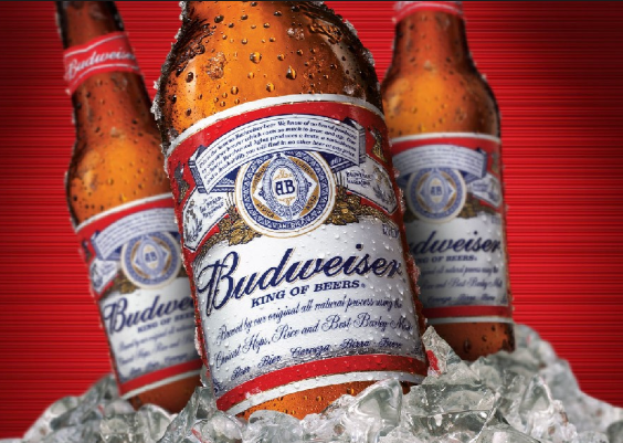
Budweiser Ad … 11 Spectacular Secrets from These Examples

How do you learn creative ideas for building new advertisements?  How would you go about it? For us, the answer is pretty simple. We learn best by studying and analyzing awesome advertisement design examples and then applying the best of the best ideas we’ve found. In this blog, we will illustrate 13 important design elements of our favorite Budweiser ad examples.
Budweiser ad
Budweiser ad.
And there are many creative advertisements to choose from aren’t there?
Budweiser ad.
The secret of all effective advertising is not the creation of new and tricky words and pictures, but one of putting familiar words and pictures into new relationships.
– Leo Burnett
Check out our thoughts on creative marketing.
Your expectations are not guarantees. Positive thinking doesn’t guarantee results, all it offers is something better than negative thinking. Did you win? A far better question to ask yourself is, “what did you learn?”
 
Learning compounds. Usually more reliably than winning does. So learn from these Budweiser design examples and you will find them useful next time you need to design an advertisement.
 
Related: Brilliant Advertisements to Rise Above the Noise
 
Here are 13 design elements we gleaned from a study of many, many Budweiser advertising examples. But don’t be fooled. They are not all equal in effectiveness, so we put them in order of importance.  Let’s get started:
 

Budweiser ad … emotional influence and persuasion

Budweiser puppy love that was, by most accounts, the biggest winner from the 2014 Super Bowl. There are no better means of influence or the power of persuasion than emotion. Hands down the best, in our opinion.
And Budweiser has been the master for a long time now. You will find the use of emotion in most of their commercials.
Experiences that trigger our emotions are saved and consolidated in lasting memory because the emotions generated by the experiences signal our brains that the experiences are important to remember. Check out this ad here.
There are eight basic, universal emotions – joy, surprise, anticipation, acceptance, fear, anger, sadness, and disgust. Successful appeals to these basic emotions consolidate stories and the desired calls to action in the lasting memories of audiences.
This puppy love commercial focuses on emotional appeal in grand fashion. It is a great example of a successful advertisement design.
One of my favorite experts in the field of creative advertising is Edward Bouches and Creativity Unbound. You’ll find lots of good examples and case studies to learn from in his blog.
 

Budweiser Superbowl commercials … tell a story

A good story has a beginning where a sympathetic character encounters a complicating situation, a middle where the character confronts and attempts to resolve the situation, and an end where the outcome is revealed. It does not interpret or explain the action in the story for the audience.
 
You will see many stories in Budweiser commercials. Here is a remarkable one about a baby Clydesdale. They don’t get much better than this.
 
Baby Clydesdale
 

Budweiser ad … coordinate identifiable music

A great ad design element is to match what viewers see with what they hear. Just like the use of emotion, Budweiser is a master of the use of music.
 
Check out this recent Budweiser commercial for great coordinated music and video:
 
And another one … Puppy love
 
This music selection in this commercial was so popular that Budweiser released a video of the group doing it. You can check it out here.
 
viewers attention
Grab viewers attention.

Grab viewers’ attention

Interesting information gets and holds attention. Keep in mind that people don’t read ads … they read what interests them. Be different and avoid normalcy at all costs. Stand out is the mantra. It’s OK to be controversial and to create conversation through the ‘buzz’. Headlines are the first place for attention.
 
I saw this commercial on the day that it aired. Since then I’ve not taken it for anything more than what I hope a corporation like Budweiser / Anheuser-Busch would have intended it to be. I couldn’t care less about accusations of financial intent & exploitation, Ad critics, or opinions on the product itself. It’s simply a meaningful tribute to those that lost their lives on September 11, 2001. 
 

Define the value proposition

A unique selling point that truly discriminates you from your competition is vital. It is essential that you give your customers reasons to select you. Paint the picture of value … make the value stand out. You won’t find many Budweiser commercials emphasizing value propositions though. Here is one that does … showing that their beer is brewed the hard way and is Beechwood aged. Check it out here.
 
Don’t need to say much as the video does the talking. Powerful.
 
visual elements
Employ visual elements.

Visual elements

Use pictures/visuals to convey the message much better than words. “Seeing is believing” and “actions speak louder than words” are two common sayings that reflect a bias and preference for visual presentation.
 
 
Next time you go out, be sure to make a plan to get home safely. Your friends are counting on you. Enjoy Budweiser responsibly.
#FriendsAreWaiting
 
That’s why it said, “For some, the waiting never ended”. For some doggies, their owners never return due to driving drunk or being hit by someone driving drunk. That’s why it’s such a powerful commercial. They promote their beer and the “drink (and make decisions afterward) responsibly” message.
 

Consider the end state values of customers

Focus on customer needs end state and not the means. The end state is the only priority.
 
This is another of Budweiser’s great stories, in this case about the lost puppy. Grabs and holds your attention until the end, when you can know the ending.

Make simple messages

Make the message as clean and simple as possible. You cannot overachieve on the simplicity of the message. A message that the reader will quickly understand.
 
Emotion is key to the Young Clydesdale ad
 
Superb visuals and visuals so simple that you quickly grasp them and don’t lose interest. Keep in mind that pictures are far more valuable than words. And the music has a way to keep you tied in.
 
Creating customer interest does not get any simpler than this, does it? A very simple, yet entertaining design, don’t you think? And the real message at the end that is very soft not selling.


Be unique

Showing social responsibility as a business is an awesome way to be unique. Check out this commercial on Epic Lyfts home.


Be relevant to your target market

Keep in mind that one message does not fit all.
 
You should start you thinking with knowing your target market. Here the target market is millennials that love to socialize. Nothing better than a beer and a burger with friends is there? Notice the focus on the subtle emotion to deliver the persuasion. Certainly relevant to this target market, isn’t it?

Picture of value

Using a great visual to show the picture of value … food and a Bud. An awesome way to create persuasion.


The bottom line

There is a reason why some change leaders succeed while others fail. At some point everybody needs to decide whether they would rather make a point or make a difference and, in the end, those that prevail choose the latter.

You just can’t say it. You have to get people to say it to each other.
– James Farley, CMO Ford
 
fresh_advertising
 
It is not what advertising does with the consumer; it is what the consumer does after reading the advertisement. So after looking over these enablers … how much have you learned?
 
Need some help in capturing more customers from your advertising? Creative ideas to help the differentiation with your customers?
 
Call today for a FREE consultation or a FREE quote. Learn about some options to scope your job.
Call Mike at 607-725-8240.
 
All you get is what you bring to the fight. And that fight gets better every day you learn and apply new ideas.
 
When things are not what you want them to be, what’s most important is your next step. Call today.
 
Test. Learn. Improve. Repeat.
 
Are you devoting enough energy to improving your advertising design?
 
Do you have a lesson about making your innovation better you can share with this community? Have any questions or comments to add in the section below?
 
Mike Schoultz is the founder of Digital Spark Marketing, a digital marketing and customer service agency. With 40 years of business experience, he blogs on topics that relate to improving the performance of your business. Find them on G+Twitter, and LinkedIn.  
 
Digital Spark Marketing will stretch your thinking and your ability to adapt to change.  We also provide some fun and inspiration along the way. Call us for a free quote today. You will be amazed at how reasonable we will be.
  
More reading on advertising from Digital Spark Marketing’s Library:
 A How-To Guidebook for Creating Winning Advertising
Brilliant Advertisements to Rise Above the Noise
The State Farm ‘Jake’ Commercial … No Art of Persuasion
 
Like this short blog? Follow Digital Spark Marketing on LinkedIn or add us to your circles for 3-4 short, interesting blogs, stories per week.