8 Beautiful Rebrands That Will Turn Your Heads

Everyone loves a good makeover, whether it’s a house, a wardrobe, or (in this case) a rebrand. There’s just something irresistible about that before and after a moment. For us, rebrands are especially exciting because they take such an enormous amount of work. Why? Because beautiful rebrands aren’t really a design challenge; it’s a communication challenge—one that requires you to use every asset available to reinforce your brand story with thought, care, and intention. 
Beautiful rebrands

Luckily, this brought us a whole new batch of rebrands to geek out over. And because we’re pretty sure you can’t resist them either, we thought we’d share some of our favorites with you to close out the year. 

Whether you’re gearing up to rebrand or just a fan of great work, we’ve rounded up 10 rebrands from all corners of the web. From print magazines to pain relievers, we hope you find a little creative inspiration in each. 

Fast Company

After having rebranded in 2018, Fast Company wasn’t ready for a massive rebrand, but they were eager to realign their visual identity to the brand’s three visual principles: sophisticated, playful, and gender-neutral.

Thus, the design team embarked on a mission to anchor their visual language through subtle changes. They moved away from aggressive all-caps headers, added iconography to distinguish sections, included a fluctuating design for page numbers, and introduced a more playful element. The result? A refreshing update that keeps the brand true to its core values.   

Rolls Royce

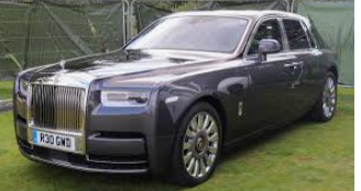
How do you take a brand built on elegance and wealth (one basically made for the Monopoly Man) and give it a younger, hipper, fresher look? That was exactly the challenge the luxury carmaker faced with their 2020 rebrand.
Rolls Royce

Pentagram led the charge by balancing a sleeker, more modern look with nods to the brand’s history. They updated the Spirit of Ecstasy emblem and refined the brand’s iconic double-R monogram. To modernize the color palette, they leaned toward more gender-neutral tones but retained the regal spirit of the brand through rich purple hues and rose gold. And for typography, they turned to Elegant Riviera Nights, featuring beveled edges that add sophistication and style.

Overall, it’s a beautiful rebrand that welcomes younger generations into the lap of luxury. 

Medium

Medium is a global platform that reaches 170 million readers, but they felt limited by their current identity. As part of their shift to facilitate more dialogue between readers and writers, they needed a creative, flexible language that would evolve with the brand and allow designers to depict an array of ideas. To achieve this, Medium tapped Collins to tackle their rebrand.
Medium

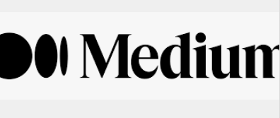
Thus, the logomark got a simple but effective polish, with tighter tracking and smoother lines, accompanied by a new symbol: a three-dot design inspired by an ellipse. The color palette also expanded, giving designers a rainbow to play with. And, as Medium is all about the written word, Collins incorporated actual language into the visual language through images created from letters and words.

This blend of creativity and functionality makes this an A+ rebrand in our book.

Buck

We love when a brand’s story lives in its visual language, and creative agency Buck brought their story to life in a beautiful rebrand.

While we appreciate every element of their overhaul, we especially love the story behind their wordmark and logomark. As the brand explains: “Inspired by our namesake, Buckminster Fuller, and his approach to the systematic design, each individual letter is based upon a common architecture.” This is thoughtful, creative branding at its best. 

GoDaddy

Fun fact: GoDaddy hadn’t touched their branding in 23 years and, boy, was that obvious. Naturally, their brand has expanded greatly in the last two decades, so a brand refresh was long overdue.

Their brighter, fresher approach is a sight for sore eyes. Focusing on the “Go” in “GoDaddy,” the new logo turns the “G” and “O” into an interlocking heart design, a clever nod to their forward-thinking approach. While “daddy” still lives in the name, then switch to a more inclusive color palette that includes a bold teal, which is eye-catching without being invasive. And the functional typeface of GD Sherpa is clean, confident, and functional, helping them communicate more effectively. 

Origo Coffee

In a move to capture the luxury coffee market, Chinese coffee brand Origo needed an elevated, sophisticated visual language to reinforce its artisanal approach and pride in its Chinese roots, so they turned to MetaDesign Beijing.

The rebrand theme was “Moved by Coffee,” and the execution expresses this in every aspect. From the elegant, round circle of their logomark (a reflection of the swirl of coffee through a filter), to the earth-toned color palette (a nod to the coffee bean), to the beautiful hand-drawn illustration that communicates the artisanal nature of the product, they crafted an elegant but grounded brand.

GO1

In honor of its 5-year anniversary, education startup Go1 needed an updated identity to bring them into the next decade, so they called on DesignStudio.

As Go1 is a platform that helps people learn quickly and effectively, the idea of “Learn Athletic” became the rallying cry of this identity. The visual system celebrates the joy of learning with a bold and colorful palette, playful illustrations (including the logomark), and graphic shapes, such as connected boxes that communicate the unique, agile way the content they provide can be connected in a learner’s life. 

Laka

Laka is an insurance company for bicyclists, but they have a unique model. Instead of paying for an accident that might happen, it’s a community collective, where people pay into a pool to cover current member claims.

To emphasize this communal angle, branding studio Ragged Edge focused the rebrand on the community itself. Bold colors celebrate the joy of cycling, used in patterns that represent the mud, sweat, and tears on a cyclist’s bib shorts. Playful type is simple but unexpected. And colorful portraits of their diverse members put a human face to the often faceless insurance industry. The result? An insurance brand that feels like a lifestyle clothing brand. That’s an epic feat. 

Intel

Intel hasn’t done much rebranding in its history. In fact, they’ve only had two logos since being founded in 1969. (That’s two logos in 50+ years!) Naturally, they were due for a rebrand.

This fresh iteration takes a more minimalist approach while expanding the tools brand designers can use to communicate the brand.

This includes an expanded color palette (a welcome change beyond the standard blue) and incorporates elements of the past—but with a modern twist. The original logo version featured an e dropped below the other letters; the second added the swirl. This new logo includes elements of both, but in a much more subtle, minimalist way. It’s a brand identity that pays homage to their history but pushes the brand into the future in a practical way. 

Midol

While Midol might be the oldest brand in this roundup (established in 1938), they were eager to build a stronger relationship with Millennials and Gen Z. Unfortunately, their research showed that the brand was so far from a mind that people couldn’t even remember the color of their packaging. To remedy this and reintroduce the brand to younger generations, Midol turned to GoDutch and Oliver.

Hoping to put the brand back in the spotlight, the design team focused on a brighter, bolder color palette of pinks, yellows, and greens that reinforce the fun and joy of a pain-free life. For typography, they went bold, reflecting modern female values of strength and independence vs. older values of daintiness and passivity. Let’s just say this is not your mother’s Midol, and we think that’s a great thing.